Posts

Showing posts from April, 2023

Final Project

Image
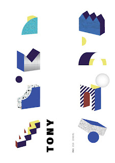
Artist Statement: For my final project for Digital Media, I put together a portfolio of all my previous works to show how I have progressed throughout the semester. First and foremost, I used a template to help me do the page layouts and for some ideas. Blue and purple colors make me feel calm and, in my opinion, look the best which is why I choose that to be the main theme. The phrase "A journey into the mind of a wannabe artist" just sort of came to me. Digital art was a real struggle for me, and I wanted to be good at it, but I just couldn't get the hang of it.   

Business Card

Image
 Sketches:  Final Products: Artist Statement:  This was an incredibly difficult project for me to accomplish because I was not here to learn how to do the business card that week of class. I was in Kansas City for a volleyball tournament, and when I got back the class was already working on the final project. With this project, I tried to make it seem that I had a film business in the selling of discs. This was because in my other class we had a project where I incorporated physical media into my work. The business card was also more difficult than the Postcard assignment because the only background with business card I have is the scene from American Psycho  (2000). I didn't like how my second card looks very similar to McDonald's as well. 

Animation

Image
Final Product:   Original Images:                             For my animation assignment, I originally wanted to use The Great Wave of Kanagawa as an inspiration, but realized quite quickly that that would be too difficult. I really did not understand how to use this function of photoshop until I came in for extra help. Professor Roundtree helped me so much and I really love how the final project turned out. I chose to focus on water for my GIF because liquids are super kinetic so even just looking at a still image, one feels a sense of motion. I was not influenced by other GIFs either.  Original Inspiration:

InDesign Homework #1

  10 Tips + Tricks I Wish I Knew In Adobe InDesign[2021] - Bing video The video by Satnam B is a highlight reel about somethings one can do while using InDesign. Little hidden tricks are a frustrating concept in apps like this in my opinion. He points out tools like a spelling checker (dynamic spelling), copying vector images from Illustrator, and how to turn your text into different shapes or colors themselves. His way of explaining the tips is pretty dry, but he gets right to the point of whatever the problem is. 10 Super Helpful Indesign Tips/Commands YOU SHOULD KNOW! - YouTube This video is very similar to the previous video that I watched. The narrator is much more engaging with the audience. It is also easier to comprehend this video as opposed to the other one. He goes over some of the same information as well. He goes over image framing as well and shows how to split the boxes into different images as opposed to one singular image. 5 QUICK InDesign Tips (NIFTY) - Bing video Fin

Postcard

Image
  My postcard was inspired by where I am originally from. I lived in Illinois prior to moving to Florida and I constantly dream of going back. Hence the "Thinking of you..." message. I put that on the back of the card, and I chose the yellow text to draw attention to the word "Chicago" which is done in the colors of their flag. The back of the card is pretty standard and can be seen on numerous other postcards. I liked this location because I have walked around this lake many times with my sister and her dog at the time. I basically am just really homesick for the city, and this was a way I could incorporate it into my work.